Pearl 1.0 - A Lesson in Taking a Step Back
I spent February deep in the code of Pearl, a wellness tracking app I've been building from scratch. Then I closed my laptop and didn't touch it for two weeks. That break turned out to be the most productive thing I could have done.
Pearl helps users reflect on their daily lives through journaling — then surfaces the hidden patterns shaping their lives. The core idea is simple: most of us don't realize how much our daily habits shape how we feel, because the connections play out over days and weeks, not hours. Pearl is designed to make those invisible threads visible.
Coming back with fresh eyes, a few things jumped out immediately.
What's working
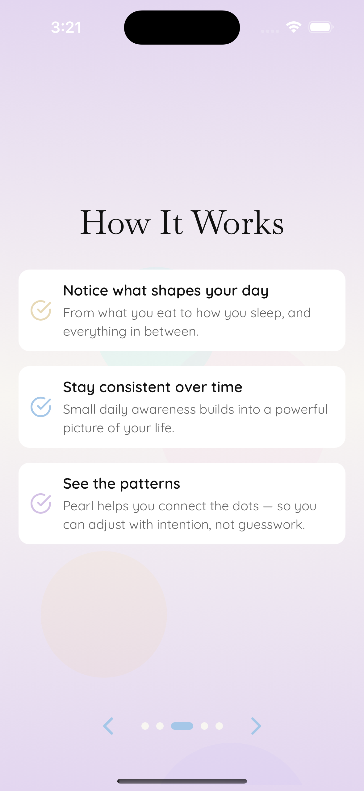
The onboarding feels right. Pearl's setup flow walks users through how the app works, then presents a few optional screens — goals, health context, notification preferences — and every single one can be skipped. I wanted onboarding to feel like a conversation, not a form. Returning to it after weeks away, it still felt that way. The pacing is gentle, the copy is clear, and users never feel trapped.
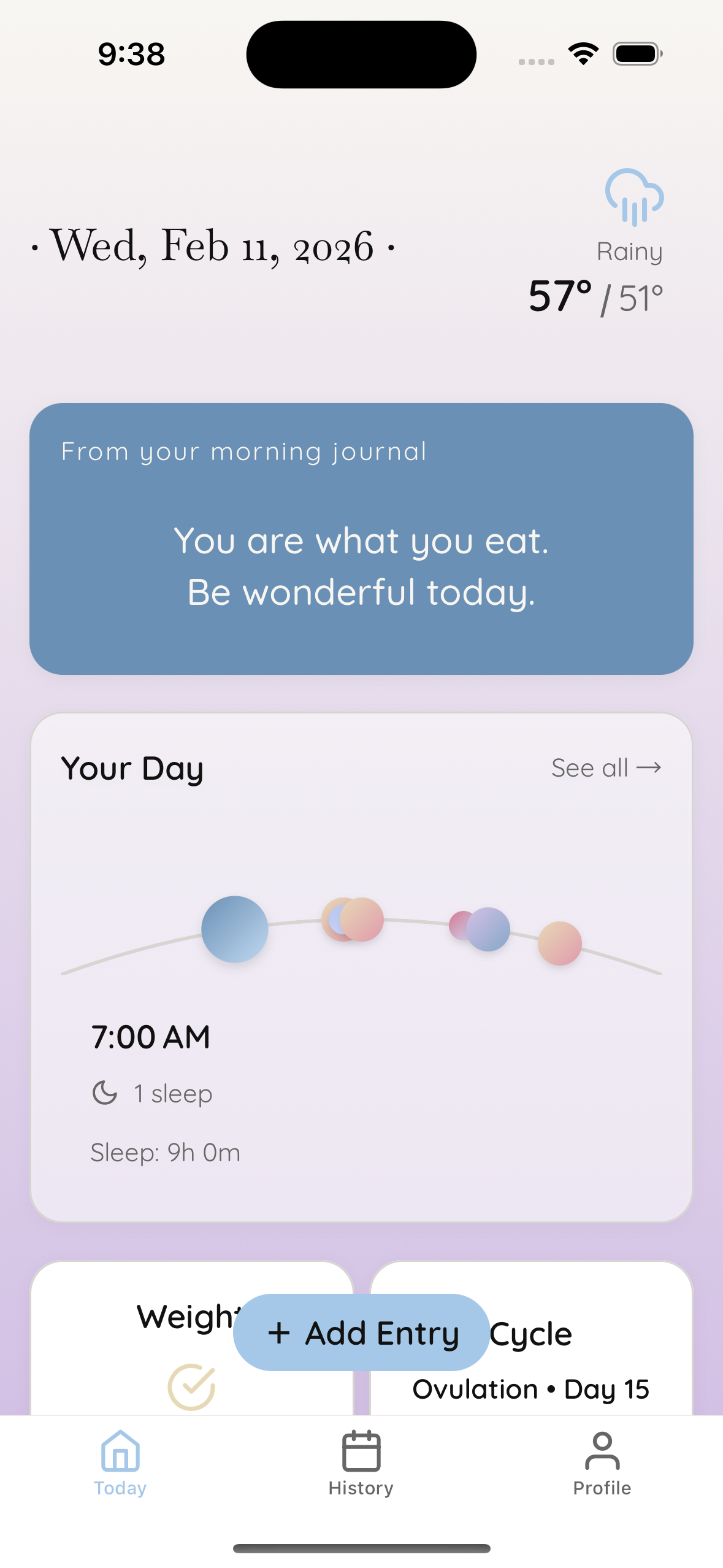
The Pearl Arc is the feature I'm proudest of. It's a visual timeline of your day rendered as a string of pearl-like bubbles along a curved arc. Each pearl represents a notable moment from your journal — a meal here, a mood there — color-coded and positioned by time. You can swipe across the arc to scrub through your day. It turns raw data into something that feels almost physical, like beads on a necklace. Nothing else in the app captures the product vision as well as this component does.
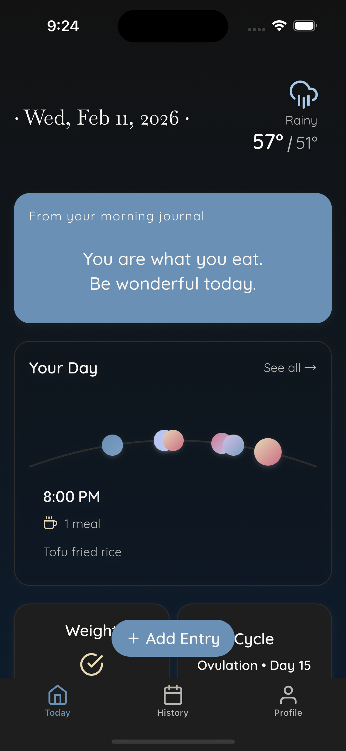
Light and dark mode both have personality. Light mode uses a warm cream palette I call "White Pearl." Dark mode isn't just an inversion — it's "Black Pearl," with deeper, richer accent tones that feel intentional rather than automated. The soft lilacs, sky blues, and warm golds carry through both themes without losing their character.
The lockdown screen earned its place. When a user marks their day as complete, Pearl doesn't reward them with more content. It locks the day and gives them a screen that essentially says: you're done, go live your life. It would have been easy to fill that moment with suggestions or prompts for tomorrow. I'm proud that I didn't. The whole point of Pearl is to return people's attention to themselves, not to keep capturing it.
What needs work
The app leans too heavily on forms. Too many screens still feel like filling out intake paperwork at a doctor's office — fields, labels, tap, next. The data Pearl collects is personal and reflective, and the experience of entering it should match that. My next focus is rethinking these interactions so they feel less like a form and more like a conversation with yourself.
The takeaway
Stepping away didn't just help me see Pearl more clearly — it reminded me why I started building it. The best product decisions I've made came from asking one question repeatedly: does this help someone understand themselves better? The Pearl Arc does. The onboarding does. The lockdown screen does. The forms don't yet. That clarity is what two weeks of stepping away gave me, and it's shaping everything I build next.